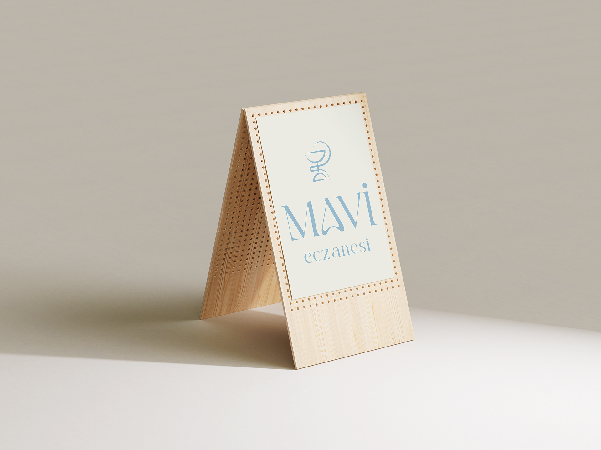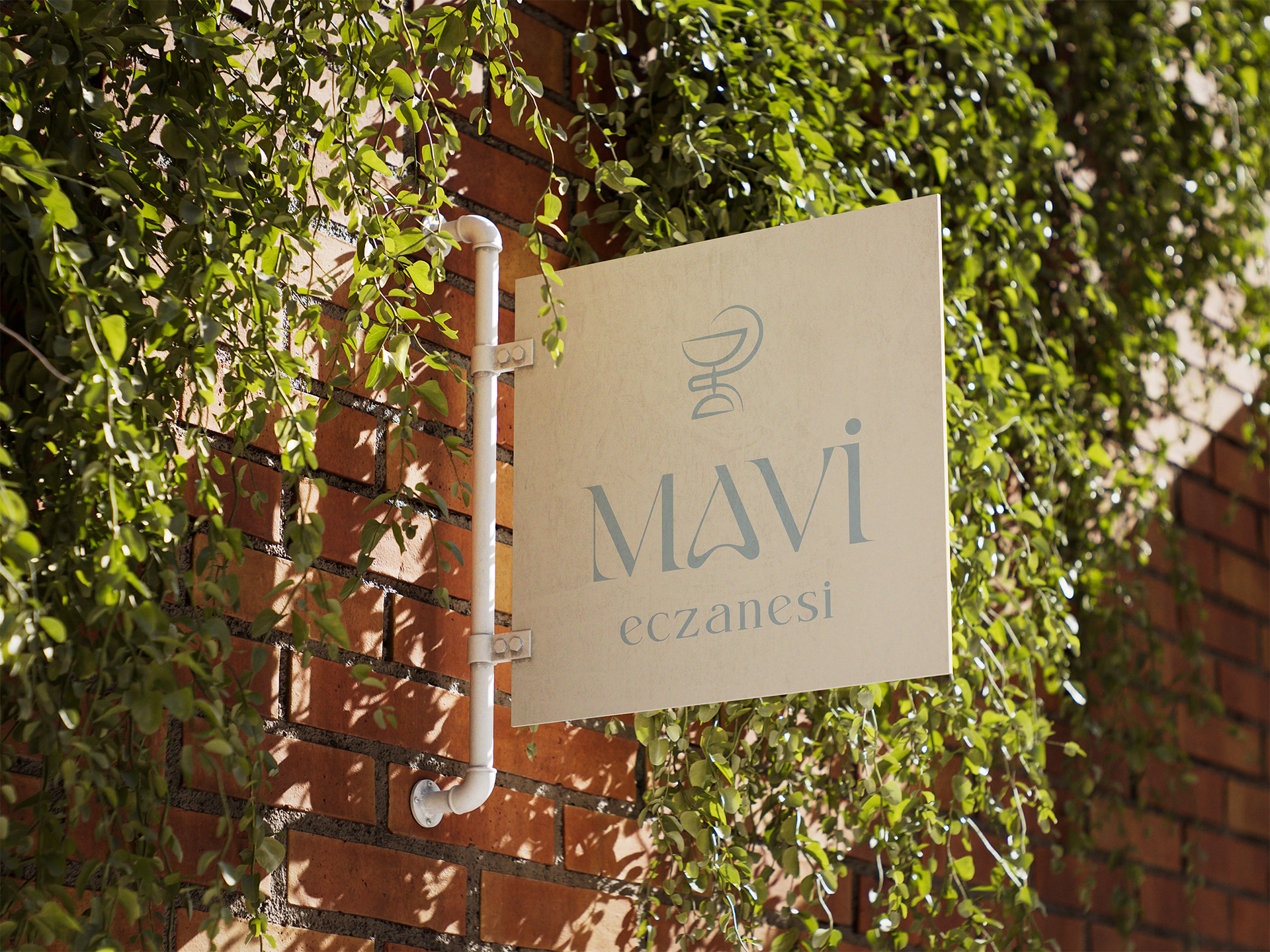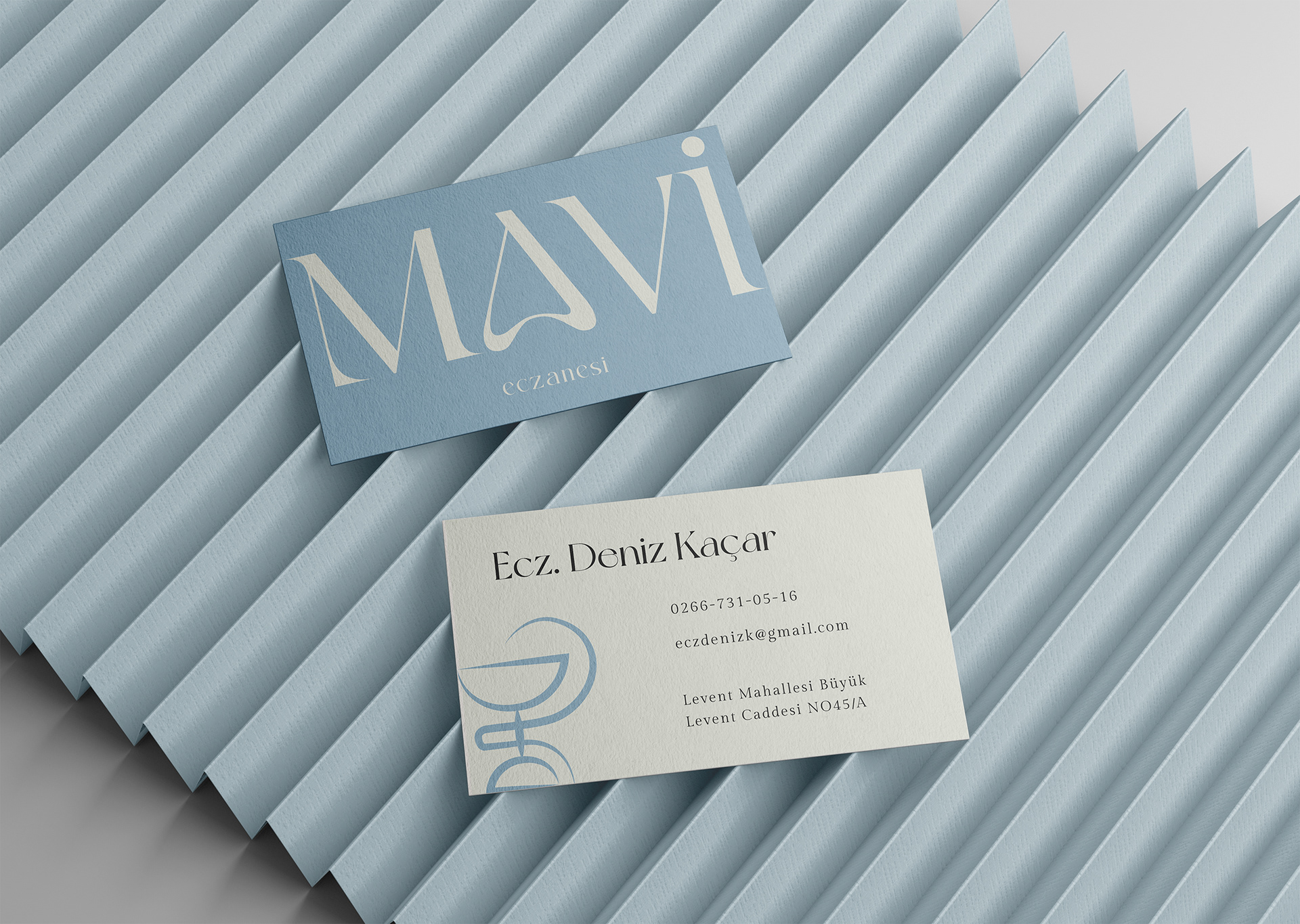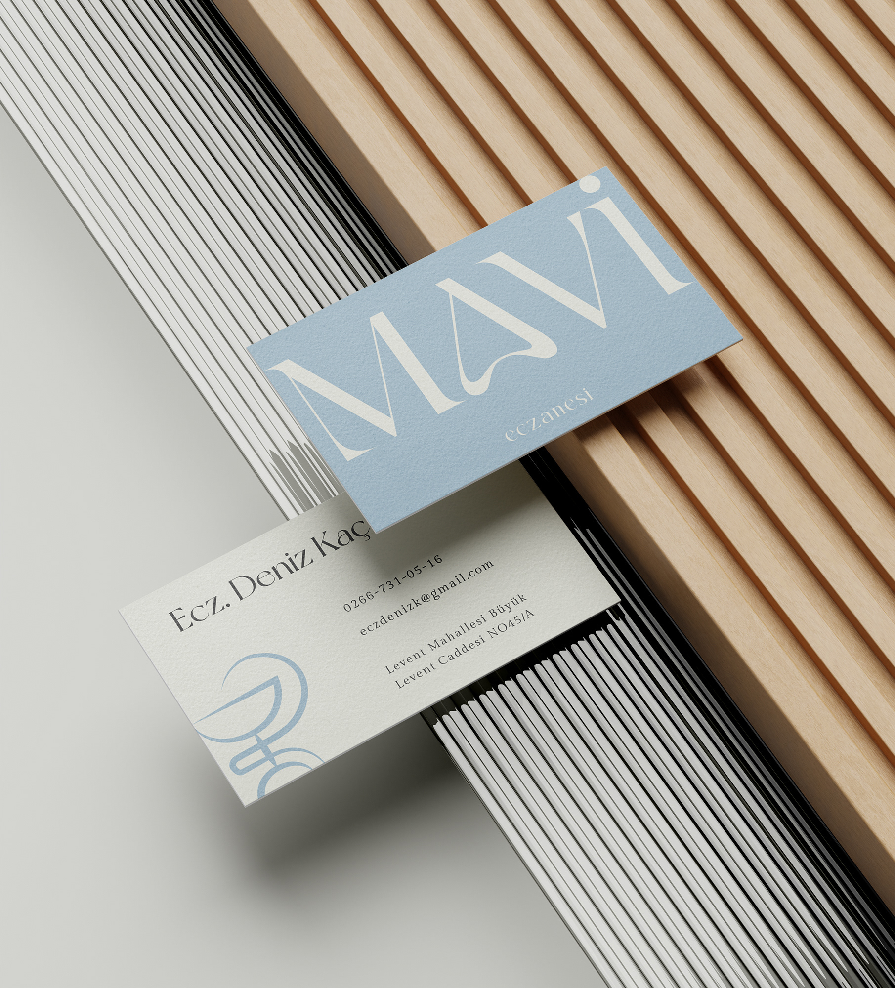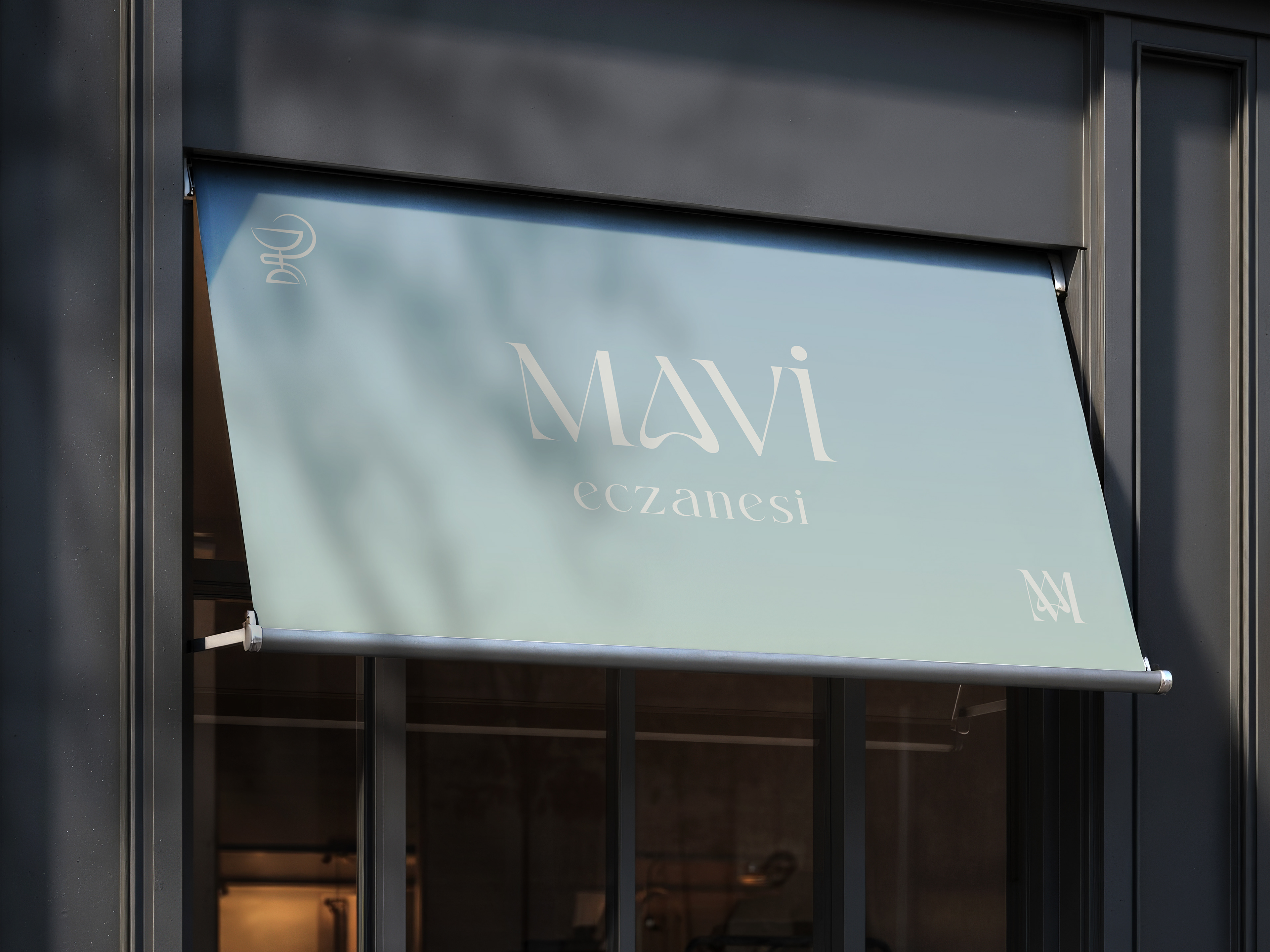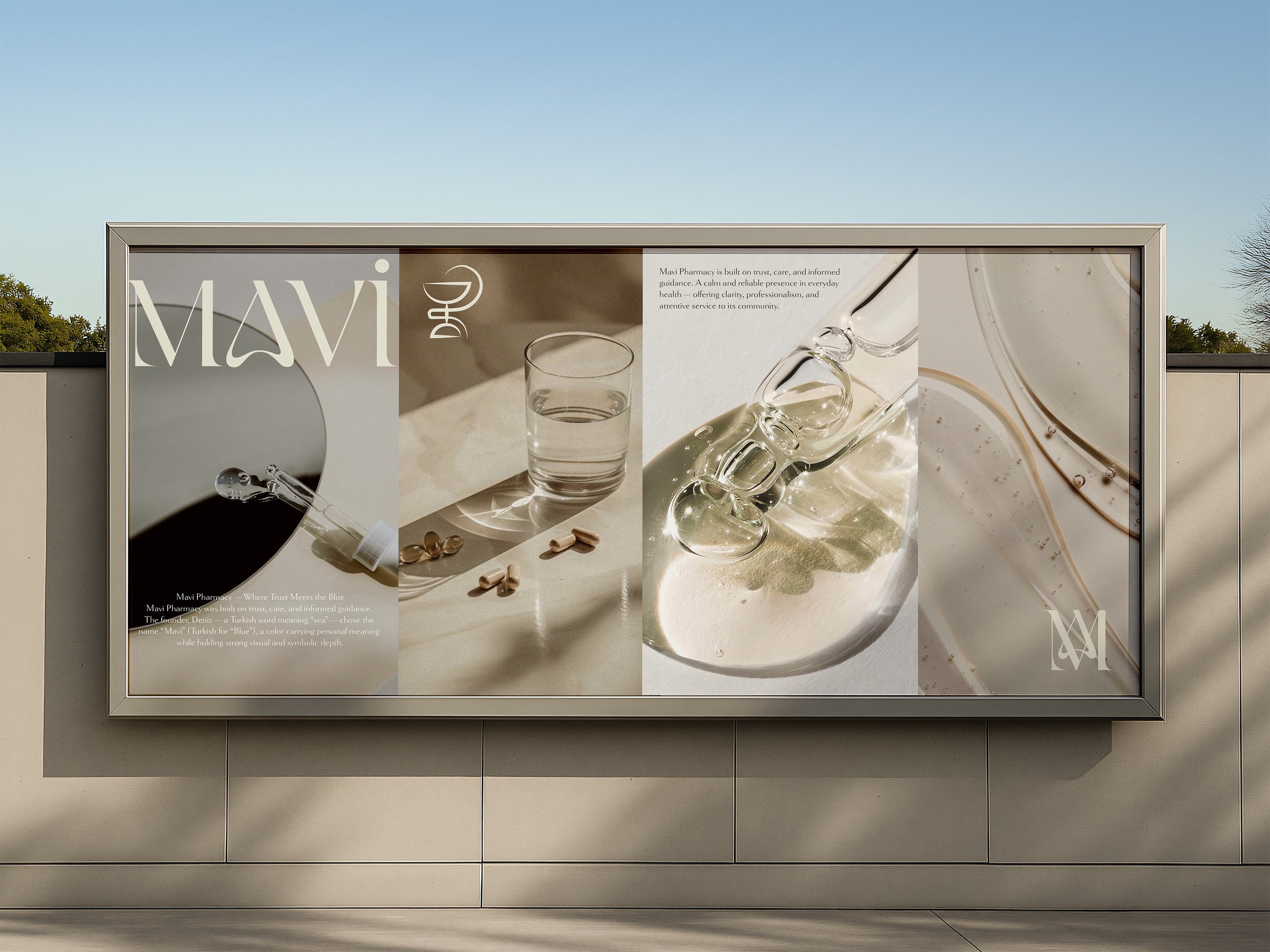
Mavi Pharmacy — Where Trust Meets the Blue
Mavi Pharmacy was built on trust, care, and informed guidance. The founder, Deniz — a Turkish word meaning “sea” — chose the name “Mavi” (Turkish for “Blue”), a color carrying personal meaning while holding strong visual and symbolic depth.
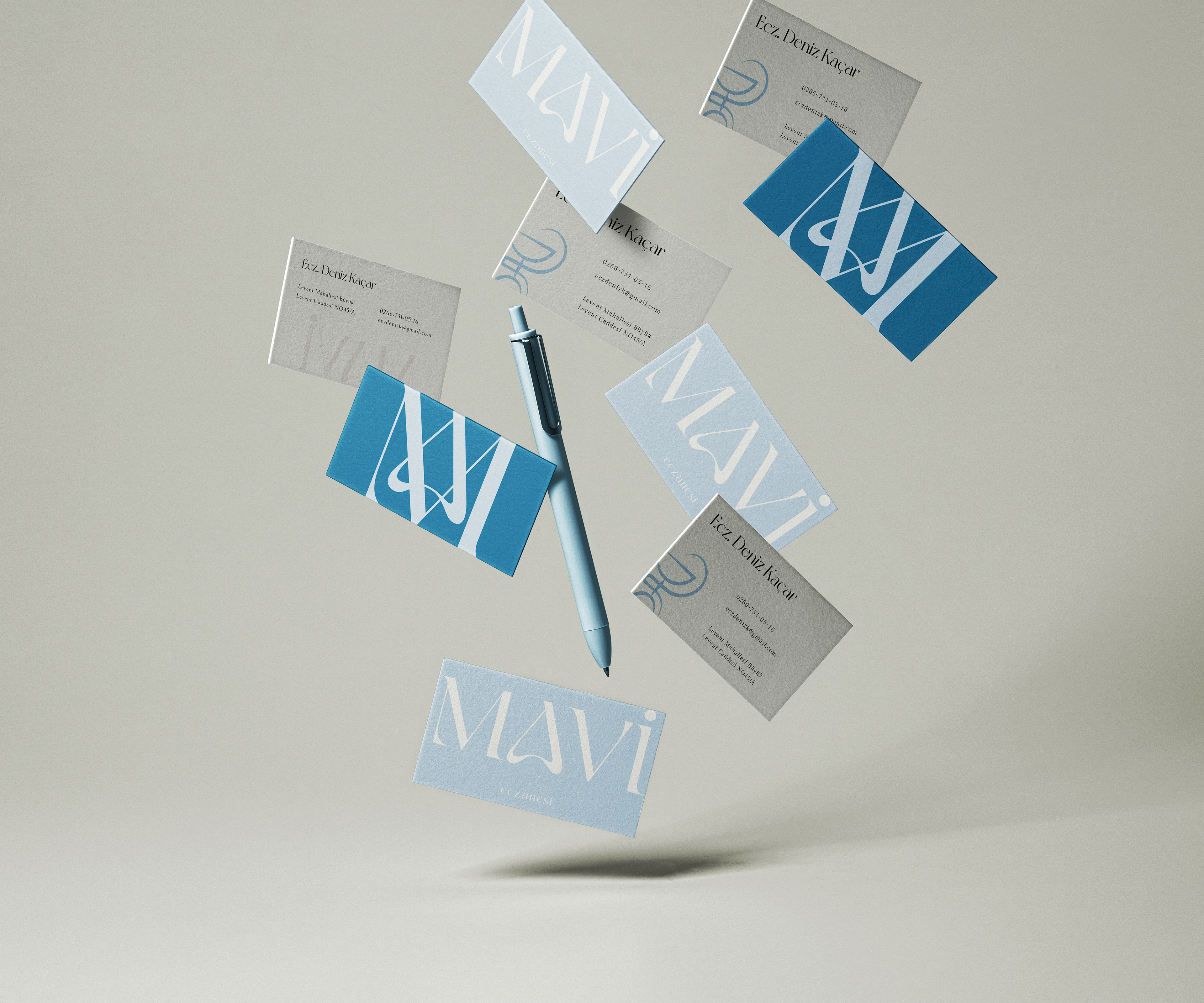
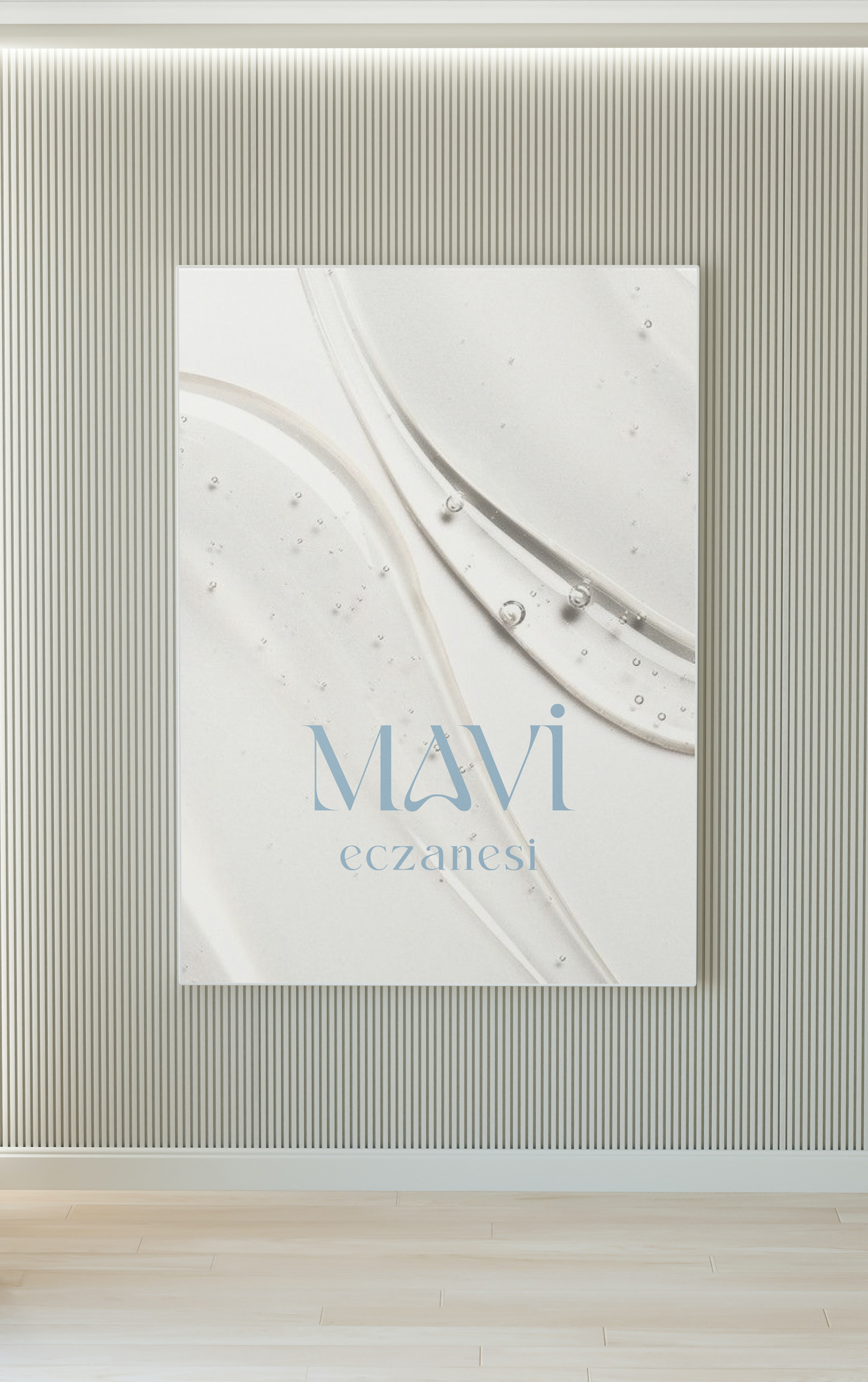
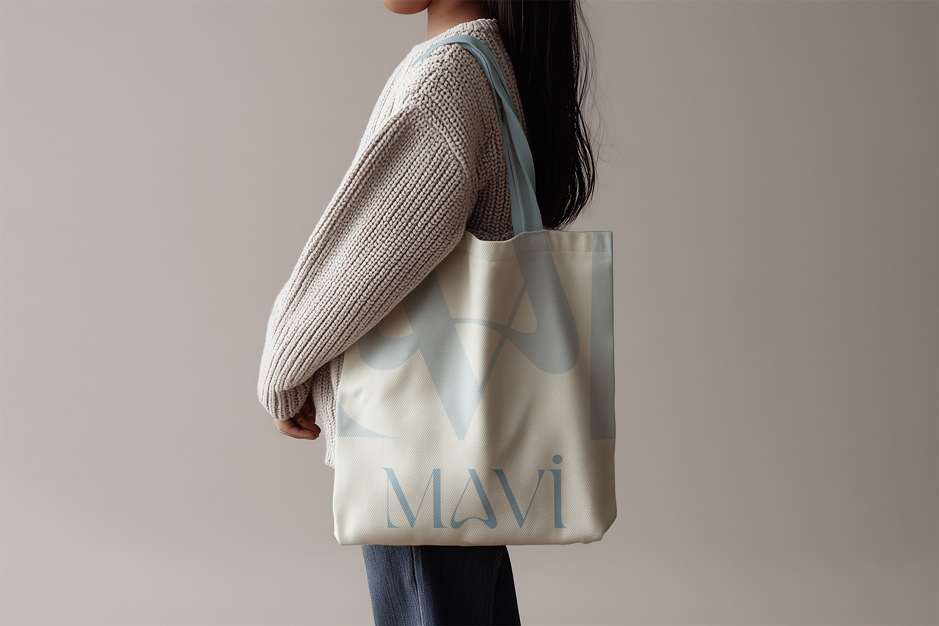
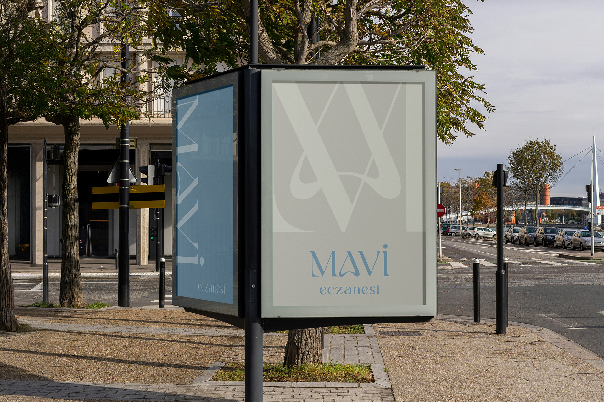
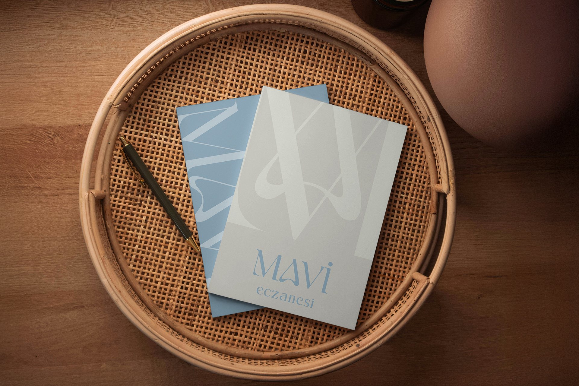
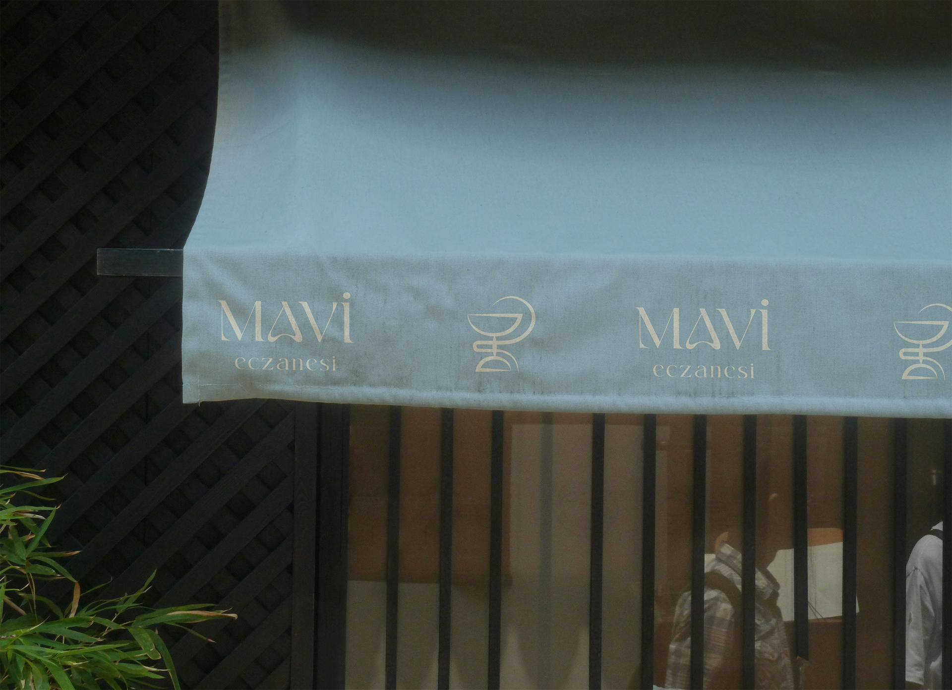
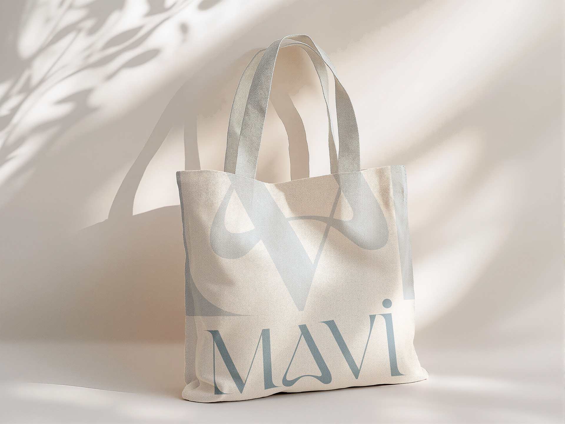
The branding process focused on translating this emotional foundation into a refined visual language. Blue became more than a color — it evolved into a narrative element representing clarity, calm, abundance, and wellbeing.
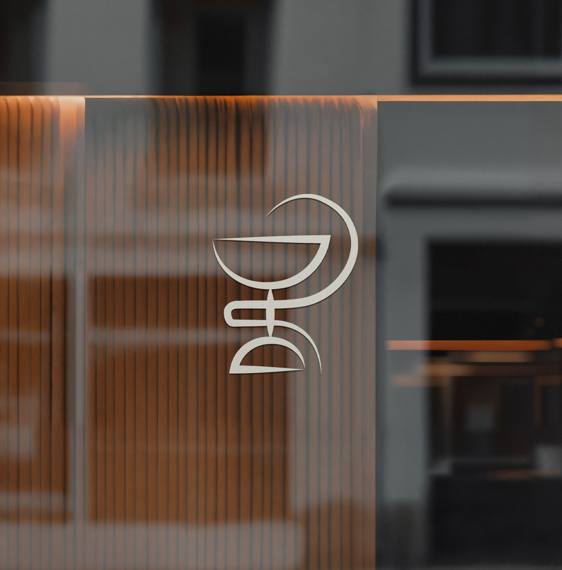
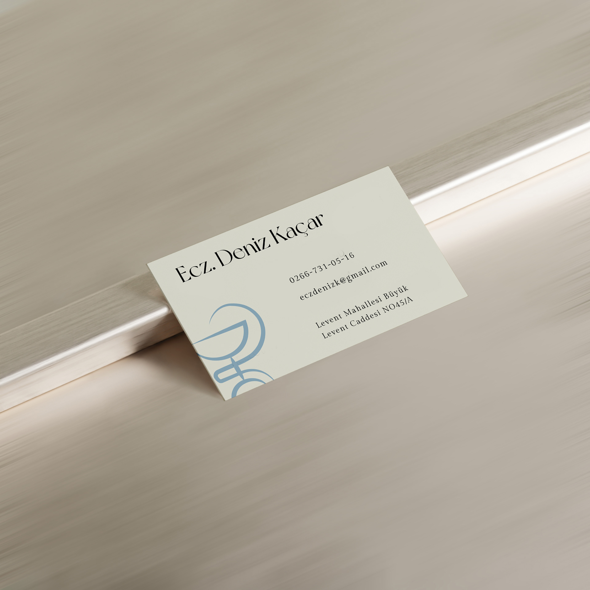
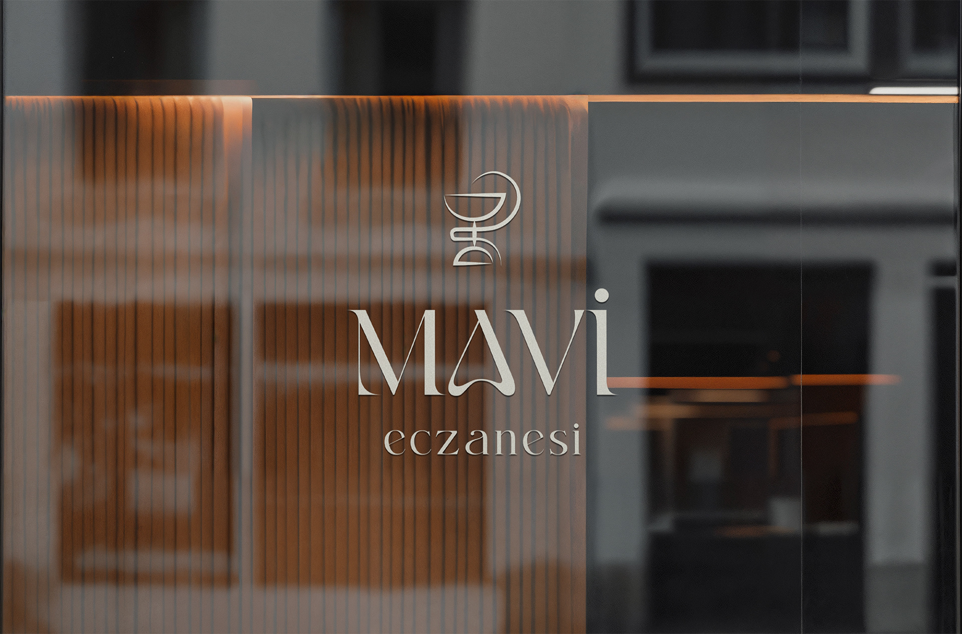
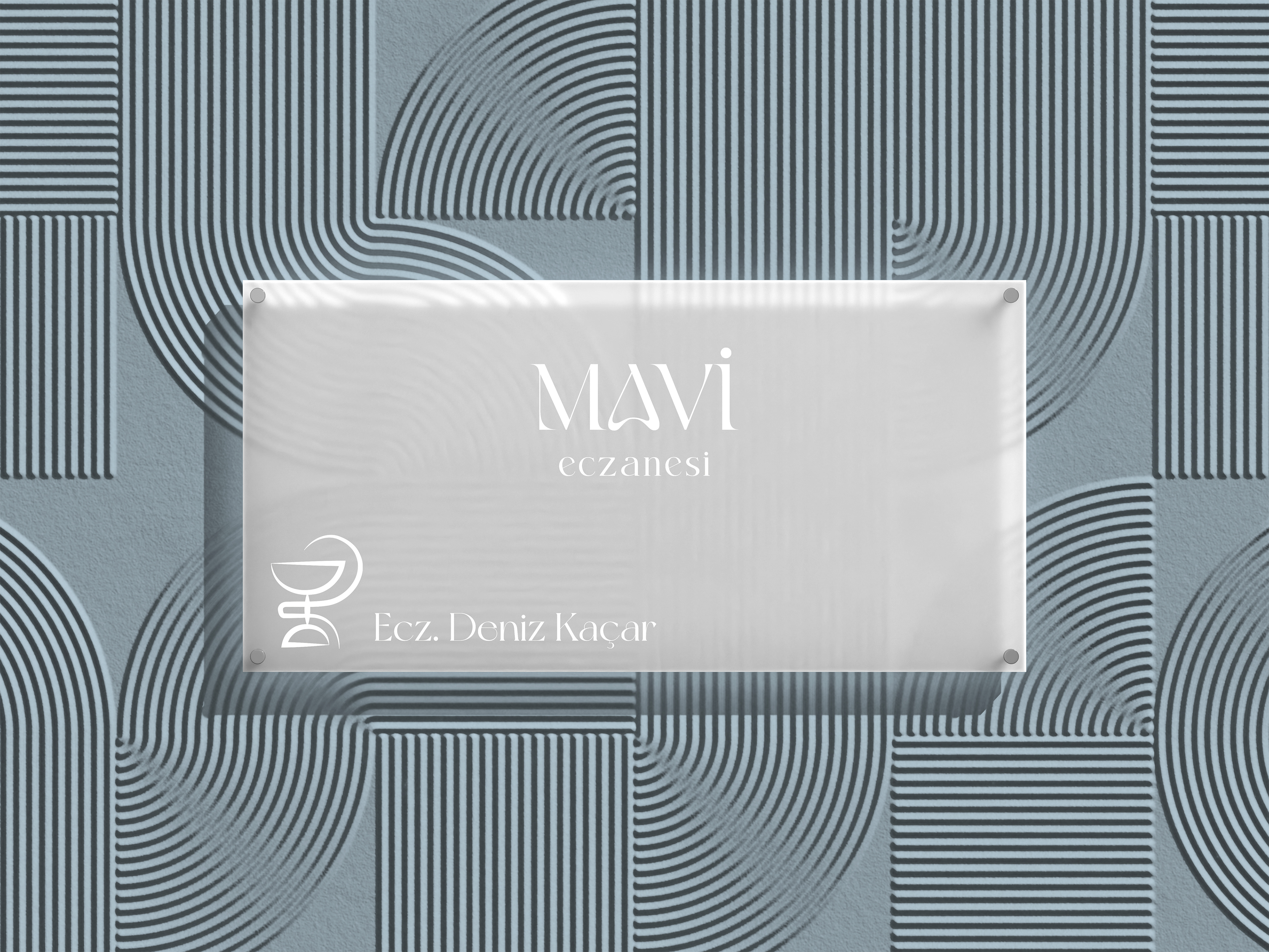
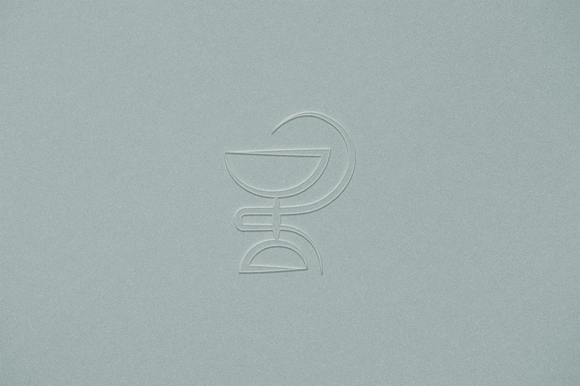
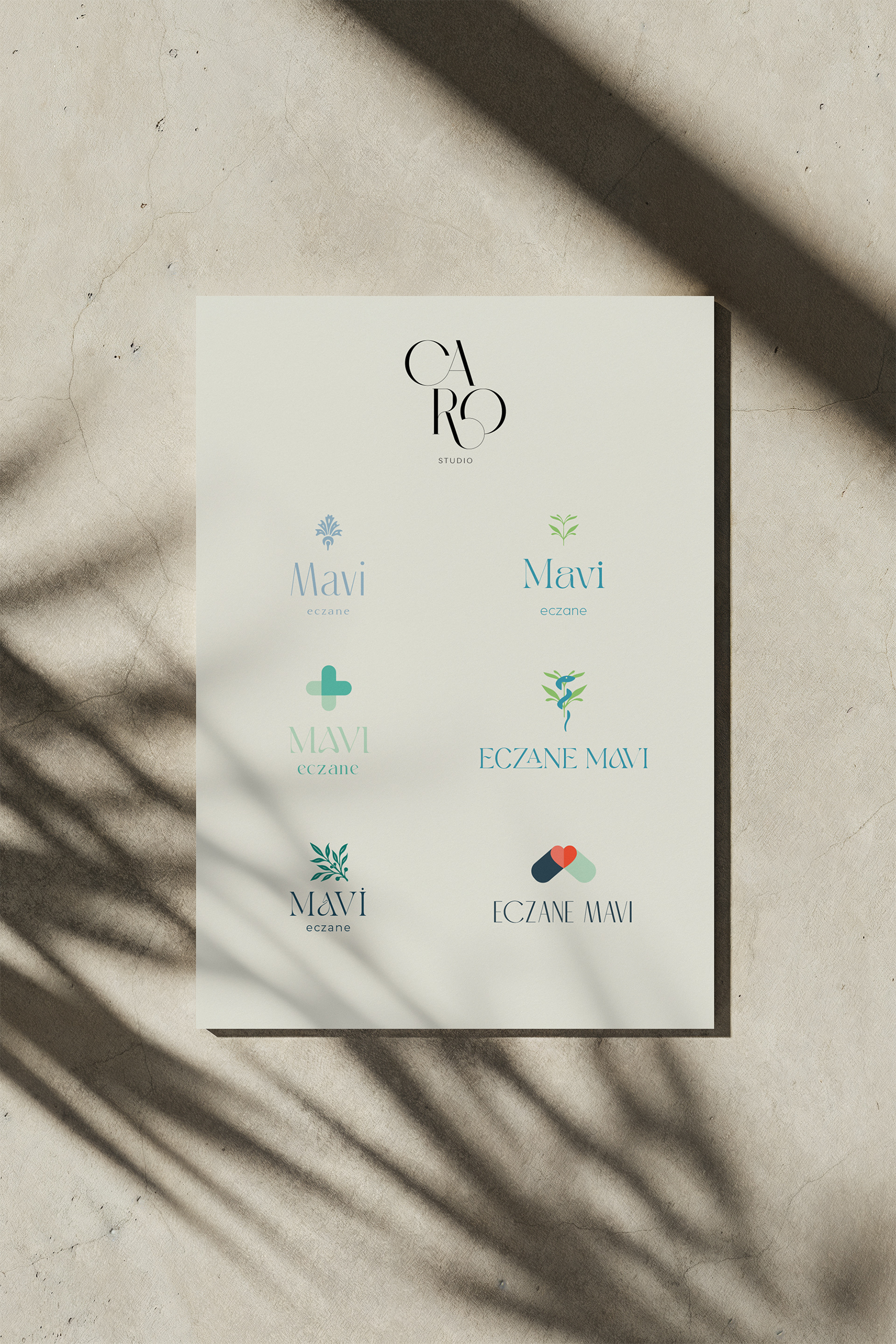
Traditional pharmacy symbols were thoughtfully studied and reinterpreted through a modern, minimal lens. Rather than relying on literal medical imagery, the identity balances heritage with quiet elegance. A disciplined blue-and-white palette, confident typography, and restrained composition shape a brand that feels professional, timeless, and trustworthy.
Located in Istanbul, Mavi Pharmacy reflects how considered, story-led design can bring depth and cohesion to a healthcare brand.